
Welcome to the latest Squire Fan Club newsletter where we look at the visual style of Squire releases, and play you the unreleased demo of 'Standing In The Rain', from the Get Smart album!
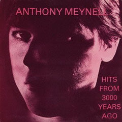
Until the release of Get Smart! in 1983, the record sleeves designs were part of the overall D-I-Y ethos of Squire, prepared and laid out with Letraset and pictures, using rulers and spray-mount glue. The sleeves of the original Hits From 3000 Years Ago LP, No Time Tomorrow, Girl On A Train and The Fan Club Album all follow this style!
However, the sound and overall ambition of Get Smart! demanded a more professional approach and it was time to find a proper record sleeve designer. The style of the time, the early 1980s was a brash colourful visual of graphics and bold colours. The designs coming out of Stiff Records had caught our eye, and also, designs for albums like Elvis Costello 'Get Happy' and 'Imperial Bedroom'.

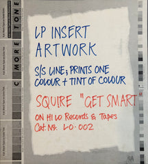
Indeed the phrase on the Get Smart sleeve credits -"Produced by Simon Humphrey from an original idea by Anthony Meynell" was copied from the Imperial Bedroom sleeve, which states produced by Geoff Emerick from an original idea by Elvis Costello". We called Stiff Records to enquire who had designed the sleeves, and they recommended their designer and art director Chris Morton who's studio was based in South London. We met and forged a relationship to re-imagine all Squire's releases.

Chris had created the iconic Stiff Logo, above, and worked on record sleeves through from his first for Richard Hall & Voidoids Blank Generation, to diverse designs for The Damned, Theatre Of Hate, Madness, Dave Edmonds DE7, and many others, under the name of his studio C-More-Tone, and his approach and skill of interpreting the musical ideas with an eccentric reading resonated with the idea of reinventing the look of the label to be contemporary so the record 'jumped out at you' from the record racks, but also retain the independent spirit of before. When we met and I described the Barney Bubbles style sleeves of the Costello albums as an example, he exclaimed that they had worked together as art directors at Stiff, which was the perfect coincidence and reference point, and from that moment he designed all of our record sleeves and became a big part of the visual identity of Squire.

The first sleeve he designed was for the upcoming album Get Smart! and the idea was everything we had hoped for! It was later nominated for sleeve of the year!
The Get Smart! concept became a package that included a full colour glossy sleeve, a lyric sheet insert, sticker, poster, badges and they incorporated a new Squire logo and Hilo Records logo - that we've used ever since!
While the Get Smart! sleeve images loosely depicted notions of 'smartness', the art was in the understanding of how the printing process would affect the colouring and become part of the creative design. The analogue printing method was exploited to its full potential by cutting and re-layering the pictures onto four separate sheets and using the four CMYK printing plates to remix the colours into a vivid explosion of pop art. Here we see the sequence of overlays for the one colour plate lyric insert.

But the complex instructions on the four overlays for the main Get Smart sleeve that the plate makers had to follow meant only Chris knew how the final printed version would look. Instead of todays digital creation on screen, where a final colour PDF 'mock up' is approved before sending to the printers, the old printing plate designs were first assembled as black and white overlays on transparent sheets, representing each colour plate, with Pantone colours as reference, but of course there was no way to demonstrate how the colours would blend.

So whilst we approved a black and white pile of transparencies taped to an art-board, we had to wait for the final colour proof from the plate maker company before understanding how the finished sleeve would look. Only then we could send the printing plates on to the next factory for final sleeve manufacturing. And of course, the results were stunning!

The sleeve idea was extended into an A2 poster that came free with the first pressing of the album, (there is a blue sticker on the front of those album sleeves) and doubled as in-store posters. The printed lyric insert finished off the idea and focused attention on the lyrics as an important and integral part of the album's overall message.

Chris then produced sleeves for 'Every Trick (In The Book of Love)' in 12 and 7 inch formats, and the second single 'Jesamine'. He then revisited Hits From 3000 Years Ago and designed The Singles Album. These later sleeves all followed a direction to stick to two colour printing to keep costs down, following the extravagance of Get Smart!, but even this constraint was used to its full potential. For instance, the yellow and blue on the record label combine to create green.

The 'Every Trick' red and blue are at different intensities and also combine to create purple.

The minimalist re-interpretation of 'Jesamine' from centre image of Get Smart! to single version amplifies the character in the image.

The red, white and blue of Hits From 3000 Years Ago combine in a vibrant explosion, exploiting the dot matrix style of news print into a third layer of imagery, and echoing the mod roots.

'The Young Idea' went back to single colours, as did the original September Gurls, printed reverse sleeve, inside (rough side) out, and again echoing a return to an organic stripped down guitar based sound.

Hence the move from minimalist white hand printed Fan Club Album sleeve to iconic Get Smart! package reflected the bands sonic move from 4 and 8-track recording to a 24-track recording extravaganza, and opened the door to a re-imagined visual identity.
Of course, behind every final version is the original idea, whether artists sketch or songwriters audio demo. Before recording Get Smart! an important step was the pre-production of recording the demos together to capture the tempos, keys and basic arrangement ideas so there were no surprises in the studio!
This week we have been enjoying torrential rainfall in the UK and the occasion has given us the chance to re-listen to Get Smart's 'Standing In The Rain', and the song provides a good example of a demo to final mix journey.
Although the song had already been demoed in different form, these new pre-production demo sessions were important to crystallise the band version of the song. Anthony, Jon & Kevin got together to record basic versions onto the four track Teac reel to reel tape machine, with simple handclaps as a rhythm, along with bass ideas and a vocal melody and harmony as references for later rehearsals and studio arrangements. So here is the original pre recording demo session version of Standing In The Rain. All the ideas used in the studio are in place, and the track was finally chosen to close Side One of the album!
Best Wishes from Squire